Gates Foundation
Modernizing a web presence & evolving a design system
Overview
The Bill & Melinda Gates Foundation hired Message Lab to redesign and re-think the web presence of its Strategic Investment Fund, which was stuck in the past with a dated website that did not reflect its identity. Our solution was a new web presence that positioned SIF as a V.C. fund while affirming its relationship to the Gates brand. The journey to the final result included a challenge to our process, a successful pivot, and an evolution of the Gates design system.
My role
As the design lead on this project, I presented our work to the client and handled all aspects of design (site layouts, guidance on brand standards, photo and video selection, and design system expertise). This heavily collaborative project required regular engagement with PM, development, and strategy teams.
View the work


Discovery & requirements gathering
Our UX work began with a discovery phase. This phase included a website audit and stakeholder interview sessions consisting of live interviews and discovery questionnaires. Discovery questionnaires included sections for Design, Strategy, and Editorial departments. After the client delivered responses, we held follow-up Teams interview sessions to dig deeper into their strategy.
Below: examples of discovery questionnaire and audit documents.
Content priority guides
Content priority guides are a pre- cursor to design and development. The high- level guides suggest a prioritized content structure for each page based on the ultimate goal of the page (for both the user and the client).
Sitemaps
Using Figma, we built sitemaps of the existing website and our new proposed redesign. Our sitemap of the proposed redesign restructures the site content in a more user-friendly stucture, as well as rethinking the approach to brand tone of voice (“Our strategy,” “Our portfolio,” etc).
An journey of iterations
Our site layout iterations took place in a design phase that included three rounds of design. We began by using Kit of Parts Figma components to assemble high-fidelity wireframes.
During this process, the client decided that they weren’t happy with existing design system components (in the ‘Kit of Parts’) and wanted to see something custom.
We added a new step in the process: I presented new, custom designs that pushed the boundaries of the Gates design system and brand. That successful presentation turned out to be pivotal: it helped tease out the client's preferred direction and strategy – and helped us push their design system forward, too.
Above: Figma iterations of the homepage design
Evolving a design system
The Gates Foundation unites all of its brand websites under the Kit of Parts design system and component library for the Sitecore CMS. In some areas of the site, we leveraged standard Kit of Parts components or made updates to them. In other areas, we learned that custom designs were required to accomplish our goals. In those cases, we approved development budget for net-new components.
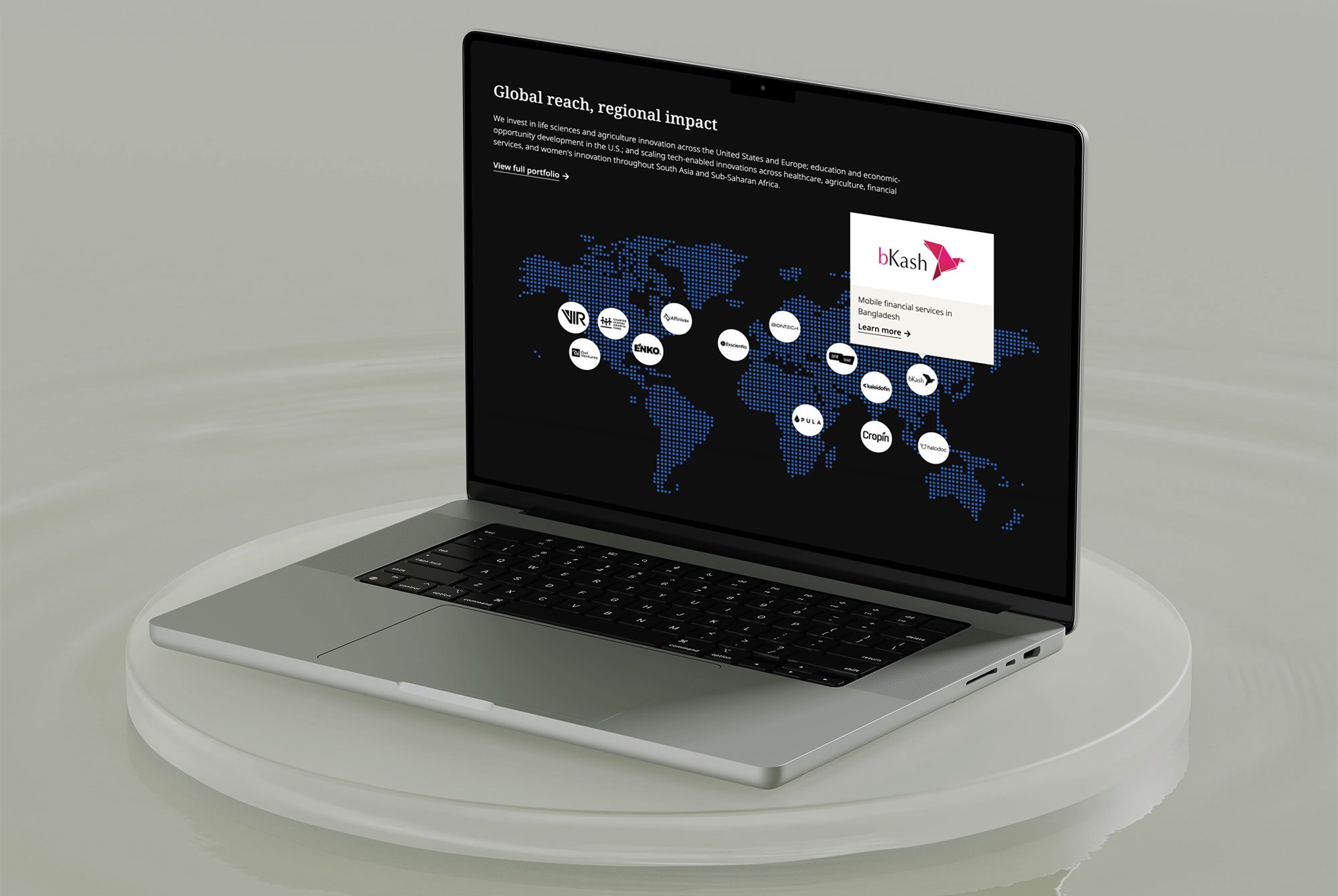
For example, we customized the interactive map component on the homepage, which shows SIF's global reach. Below, see a comparison of the standard Kit of Parts map functionality (left) and our customized version, with the following additions:
Map uses logo icons instead of numbers for better visibility into intended functionality and user experience
Added a dek/subheadline to the map headline area as well as popups
Colors are customized for SIF’s visual design
Standard Kit of Parts map component
Customized SIF component
An interactive portfolio
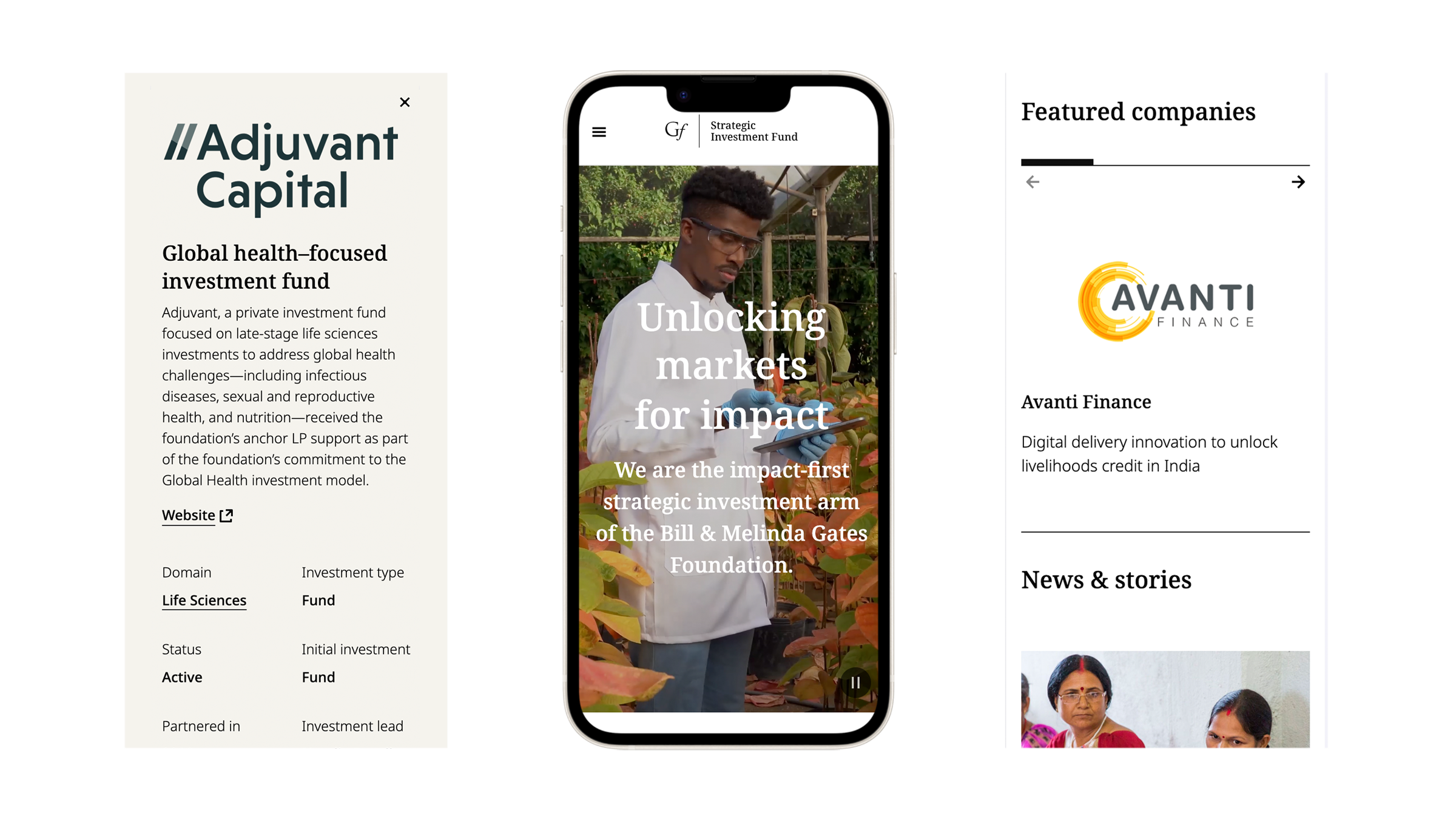
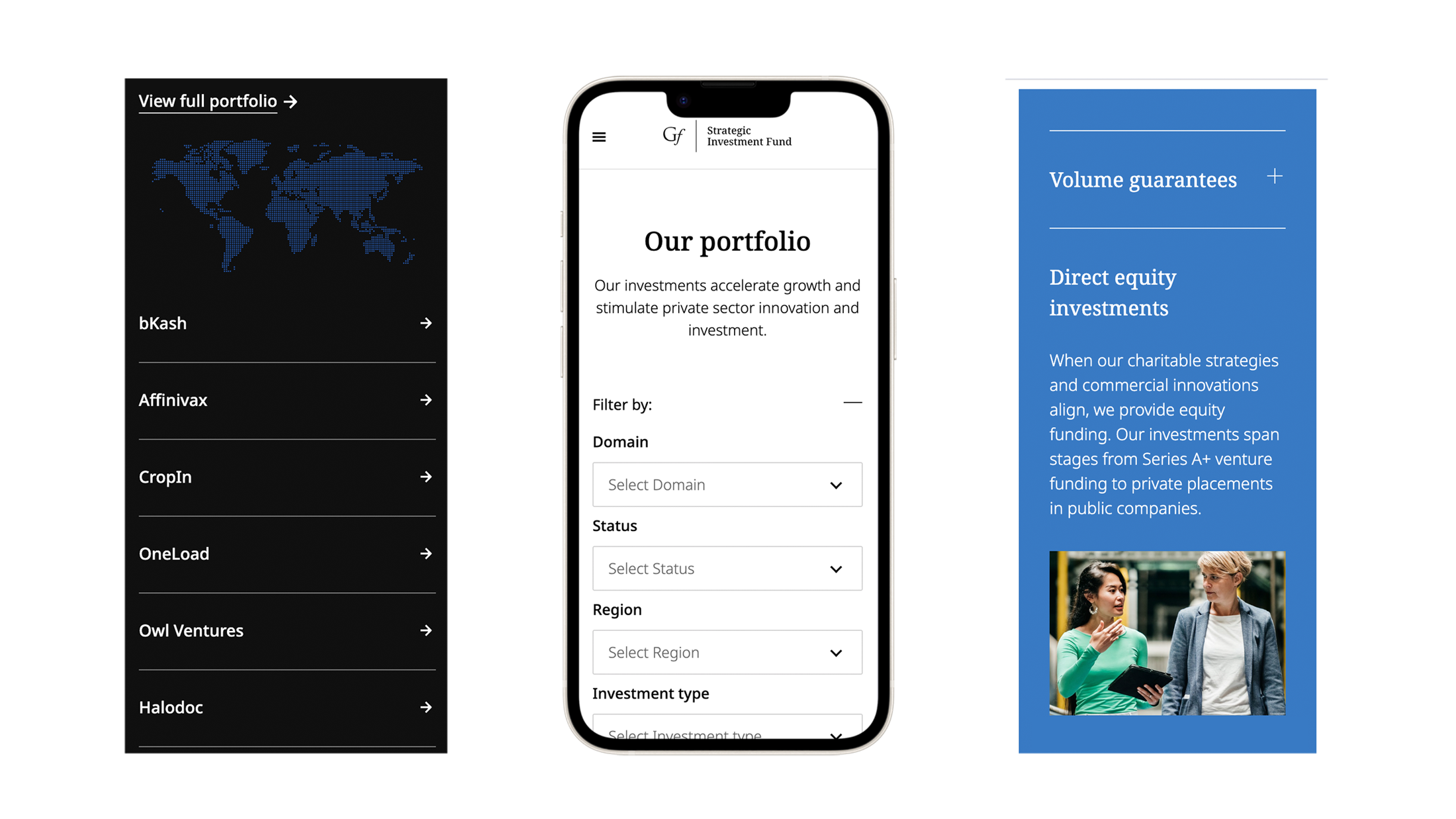
We developed an interactive portfolio with expandable cards for 100+ portfolio companies. This fully custom component proved to be one of the most complex challenges of the site, raising questions about information architecture, the user's needs, and the client's business goals. Ultimately, we developed a hierarchy of information about each company, annotating our final designs with detailed specs for developers.
Enhancing usability
In order to maximize usability of the expandable cards on the site's portfolio page, we asked that each entire row of the portfolio should be a linked element that would expand the card. Once we determined that the Domain field was a live link, the development team informed us that the whole panel would not be clickable (since the links would conflict), and only the plus symbol would be open the card. I asked to make the logo and 'impact headline' linked too, and developers agreed that the logo would open the card. Once the logo was changed to a link, I noticed that the cursor state was set to default, and requested it be changed to pointer in order to send a cue to the user that it is a functional element.
In some areas of the site, we leveraged standard Kit of Parts components or made updates to them. In other areas, custom designs were required to accomplish our goals. In those cases, we approved development budget for net-new components and revised the scope accordingly.
Before the redesign
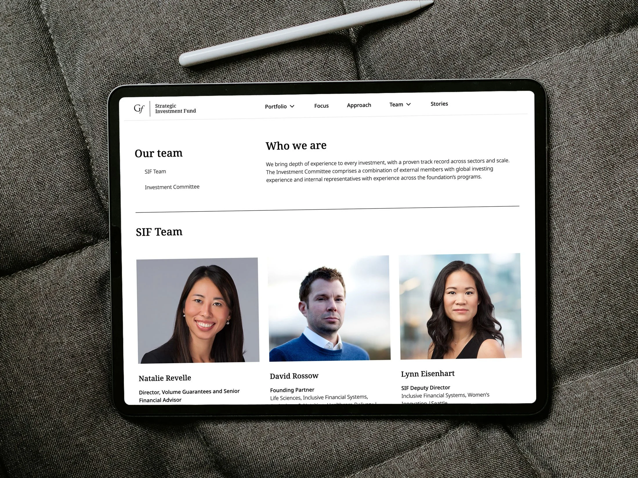
After the redesign
Big wins
Our redesigned SIF website was launched to much fanfare in early 2024. We achieved the following:
Modernized SIF’s web presence and repositioned their brand story according to their values
Reinforced SIF’s relationship to the Gates brand
Provided an evolutionary step forward for their Kit of Parts design system


